CONTACT
Selected Hardware Product
Industrial product design · product-family development

Project Overview
After our team finished a product research case for Zhongjie, the company wanted to establish a new sub-brand, so we made relevant appearance designs for the products of this sub-brand.
The design was approved by the client and was showcased and initially sold at CIMA 2019. At present, the series has been mass-produced and put into use.
Role
Product Researcher and Designer
Team
Cross-functional collaborators
Responsibilities
Research, systems thinking, prototyping and design decisions
01 Design
The client needed a recognisable product family without introducing unnecessary manufacturing cost. I developed form and colour rules that could give the new sub-brand its own character while remaining compatible with existing structures, parts and production constraints.

The final design was approved by ZOJE, presented at CIMA 2019 and later moved into mass production. This close-up shows the new product-family language applied to a production-ready machine, combining restrained body surfaces with clear functional detailing around the working area.
02 Context

The wider research involved 15 researchers, 35 participants and 358 research questions. I joined the fieldwork in Shantou and Shenzhen, interviewing and observing factory staff, then analysed material from five factories to translate operational and purchasing concerns into design criteria.
03 Key Findings
Operators and buyers did not judge a machine on appearance alone. Reliability, ease of maintenance, established operating habits, workshop conditions and trust in the manufacturer all affected the decision. The exterior therefore had to communicate durability and familiarity, not simply look new.
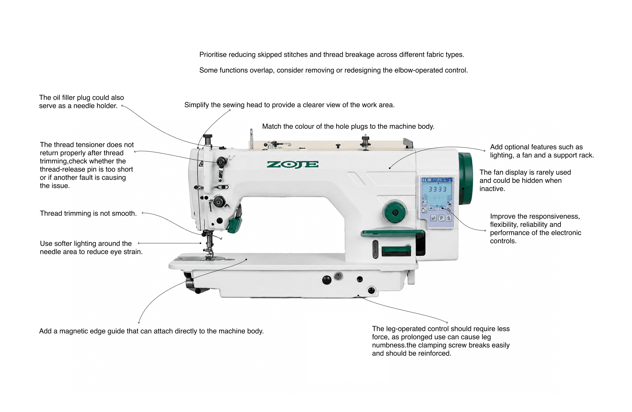
Field research highlighted practical issues around eye strain, trimming quality, material positioning, repeated leg effort and the responsiveness of electronic controls. These observations led to improvement opportunities such as better task lighting, magnetic edge guidance and more ergonomic control mechanisms.
04 CMF Analysis Summary
I kept the palette restrained and placed colour only where it strengthened the family identity or clarified a functional area. Finishes were selected with factory production, cleaning and long-term wear in mind, so the CMF direction could survive beyond a presentation render.

The CMF study compared machine structures across steel, alloy, plastic and other components, together with processes such as sandblasting, coating, polishing and stamping. This mapping kept the design compatible with existing manufacturing methods while using colour selectively for product recognition and functional emphasis.
05 Sketch
Sketch development explored how one visual language could adapt across different machine types. I refined proportions, surface transitions and component relationships while checking each direction against manufacturing cost and structural constraints.

Sketch development tested how one visual language could adapt to different machine architectures. The variations explored body proportions, arm geometry, control placement and protective housings, gradually narrowing the direction towards forms that were distinctive, coherent and realistic to manufacture.
06 Final Product
Overlock sewing machines were not the company’s main product category, and their form differs noticeably from that of standard lockstitch machines. Even so, this concept made the strongest impression on the customers we presented it to.
The original design statement described it as: “Cliff-like surfaces meet to create an interplay of geometric cuts, while the softer curves convey the strength and stability of a mountain.”
Although the description is poetic, it reflects the care we put into refining the transitions between surfaces, adjusting the proportions and reconsidering the overall form. For me, this project showed that the character of a product often comes from details that have been examined and adjusted many times.

