
One heading hierarchy
Work cards now use the card-title role rather than the section-title role. All three main card families share the same title scale.
 CONTACT
FAN YE / PORTFOLIO
A working reference for the portfolio's visual language: the foundations we share, the components we reuse, and the differences we keep on purpose.
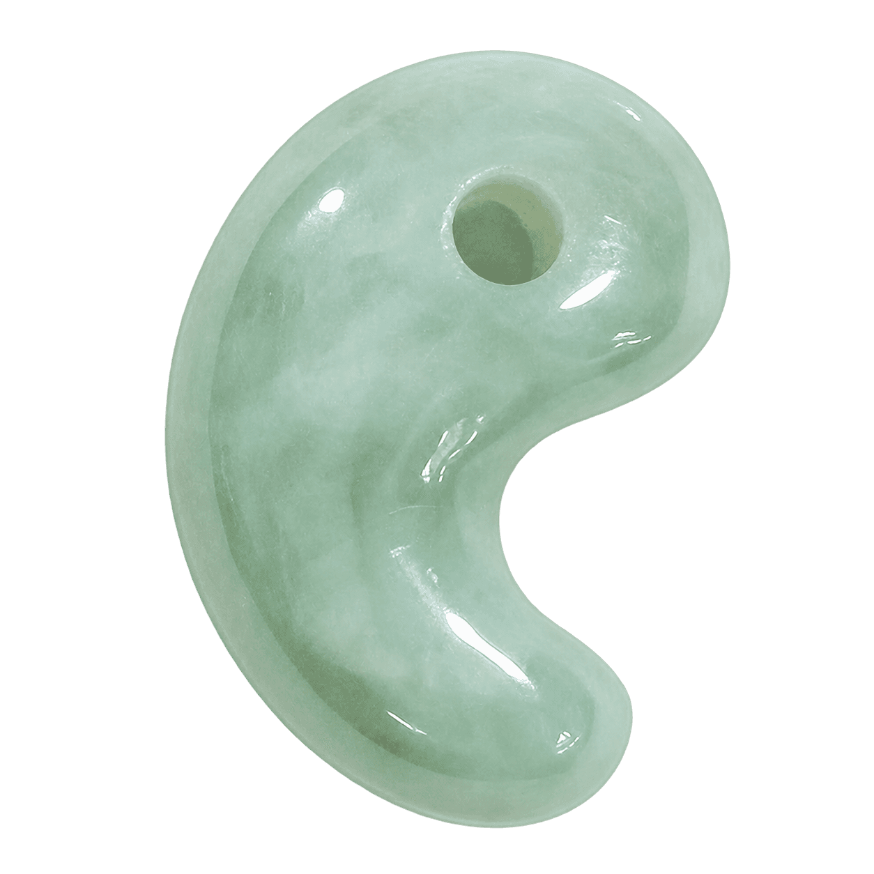
The supplied pale green jade image is the personal identity mark. Its natural color stays in the artwork; the interface keeps the neutral palette. The header uses a 48px square, without cropping or an added frame.
public/assets/fan-jade-logo-transparent.pngToken values below are read from the site's CSS at the current viewport. Components are rendered from the same source used in the portfolio.
One self-hosted variable family. Regular for reading, medium for hierarchy. No negative letter spacing or viewport-scaled type.
--font-sansBody 400 / headings 500Mobile breakpoint 767px--type-display / --leading-display · 500--type-display Making complex things clear.
Homepage positioning and project headlines--type-page-title / --leading-page-title · 500--type-page-title Making complex things clear.
About and reference-page titles--type-section-title / --leading-section-title · 500--type-section-title Making complex things clear.
Featured cases, work categories and experience--type-card-title / --leading-card-title · 500--type-card-title Making complex things clear.
Featured, Work and Fun project cards--type-item-title / --leading-item-title · 500--type-item-title Making complex things clear.
Related projects and smaller headings--type-body / --leading-body · 400--type-body Making complex things clear.
Introductions, case studies and descriptions--type-meta / --leading-meta · 500--type-meta Making complex things clear.
Clients, roles and compact navigation--type-caption / --leading-caption · 500--type-caption Making complex things clear.
Eyebrows, tags and supporting labelsValues above are live size / line height in px. Display, page, section and card titles step down below 768px; smaller roles stay stable.
Source app/globals.css
Twenty neutrals, from plain white to deep black. These reference colors feed the site's semantic roles. The jade identity mark keeps its natural color; it is not a green UI accent.
HEX and RGB are the web color specifications. Swatch labels switch between dark and white text to preserve contrast. Project imagery and original brand colors are not recolored.
--text-primaryDeep Black · Headings and high-emphasis text
--text-primary--text-secondaryGraphite Black · Reading text and secondary content
--text-secondary--text-mutedDescriptions and supporting content
--text-muted--text-on-darkSnow White · Labels on dark actions
--text-on-dark--action-primaryLacquer Black · Contact, send and primary buttons
--action-primary--action-hoverInk Black · Primary button hover
--action-hover--surfaceCards and white surfaces
--surface--surface-mutedMoon White · Neutral controls and inset surfaces
--surface-muted--surface-hoverSilver White · Subtle interaction feedback
--surface-hover--surface-disabledLead White · Inactive control fill
--surface-disabled--text-disabledRaven Gray · Inactive labels, never reading text
--text-disabled--backgroundPlain White · Fun and case-study pages
--background--background-workWork index only
--background-work--background-homeWhite background behind the logo strip
--background-home--background-aboutAbout only; independently scoped
--background-about--surface-softTranslucent featured cards
--surface-soft--nav-surfaceFloating navigation
--nav-surface--border-subtle1px project-card outlines
--border-subtle--border-strongFrost White · Inputs and stronger separators
--border-strongNavigation uses a soft shadow; project cards use silver-white outlines. Transparency and shadows derive from the palette's deep black and snow white. Stronger shadows are reserved for overlays.
--nav-shadowSource app/globals.css · page-scoped CSS Modules
Shared rhythm, contextual containers. Not every page has the same content density or image geometry.
--page-width-desktop Home / About--page-width-tablet below 1200px--page-width-mobile at a 390px viewport; 24px side gutters--space-1--space-1--space-2--space-2--space-3--space-3--space-4--space-4--space-5--space-5--space-6--space-6--space-8--space-8--space-10--space-10--space-12--space-12--space-16--space-16--space-24--space-24A 4px foundation for new work. Existing optical gaps and image crops are retained rather than rounded to fit the scale.
--radius-controlCompact tool surfaces
--radius-smallPortrait and small overlays
--radius-imageFeatured-card inset imagery
--radius-cardWork, related-project covers and Fun cards
--radius-featureLarge homepage cards
--radius-pillPrimary actions and compact inputs
Source app/globals.css · component CSS Modules
The same components in different contexts. Links remain links; modal triggers remain buttons. Content, not a new visual theme, makes the distinction.
Live components: ProjectCard · WorkListCard · ProjectPreview · FunProjectCard
Icon-only controls have accessible names and visible focus.
Source components/ · app/fun/
Motion supports the reading sequence. Scroll-linked transforms are reversible; interaction feedback stays restrained.
Uses the homepage card's actual responsive transform settings. On the homepage, scrolling controls progress; here, the slider isolates each state.
--duration-fast text / --duration-standard related-cover zoom (1 → 1.025)Source components/useScrollPopUp.ts · components/Reveal.module.css · page-specific motion styles
A record of what is shared, what is deliberately different, and what still needs a contextual decision. Not an invented consistency score.
Work cards now use the card-title role rather than the section-title role. All three main card families share the same title scale.
Twenty named neutrals feed semantic roles. Home stays snow white, Work uses moon white, and About uses plain white. Page backgrounds remain independently scoped.
Project-card outlines share one border token. Featured and Work cards have visible focus rings. The four-item navigation fits on a separate row on small screens.
Featured cards are large and scroll-linked. Work cards are denser. Related projects are unframed links. Fun cards reveal an immersive overlay. Their geometry is not forced into one template.
Fan AI keeps its 11-16px compact scale and 22px shell, using the neutral UI palette. The jade identity mark, original illustrations and project images keep their natural colors. Fun overlays retain their image-legibility treatments.
Some layouts still use optical spacing and fixed image crops rather than the 4px spacing scale. Preserve those until a specific layout change is agreed; do not round them automatically.
Change shared typography, colors, spacing and radii in app/globals.css. Keep usage notes in content/designSystem.ts. A page-specific change belongs in its CSS Module, not a global override.
The jade mark is a transparent PNG, shared through content/brand.ts and BrandMark. Preserve its proportions and natural color. Use the background-extracted asset without a white rectangle, added frame or color-blending effects. The original image is kept separately as a reference. Scroll geometry and other interaction settings stay with their components.
Documentation structure informed by Material Design 3. This portfolio keeps its own visual identity; no Material UI package or theme is used.