CONTACT

Protected Project
This project contains confidential work. Please enter the password provided.
Access is provided for portfolio review purposes only.

INDUSTRY COLLABORATION

CPAP Patient Support App

CPAP Patient Support App

CPAP Patient Support App

Digital health · Patient experience · UX research

A low-burden reporting experience that helps patients share meaningful context throughout CPAP treatment.

Project Overview

This project investigated how patients could report their treatment experiences without creating unnecessary daily burden. Through weekly check-ins and event-triggered questions, the app captures information about fatigue, comfort and therapy issues when it is most relevant to patients and care professionals.

Role
UX Researcher & Product Designer

Company / Client
Philips · Sleep & Respiratory Care

Team
HTI&UX supervisor and patient-testing support

Responsibilities
Research, questionnaire design, interaction design, frontend prototyping, online user testing, qualitative synthesis and design iteration

01 Solution

A CPAP device can show hours of use, AHI and mask fit. It cannot tell whether the patient was travelling, ill, exhausted or struggling with the mask. I designed a lightweight reporting layer to capture that context through a weekly check-in and short questions triggered by meaningful changes.
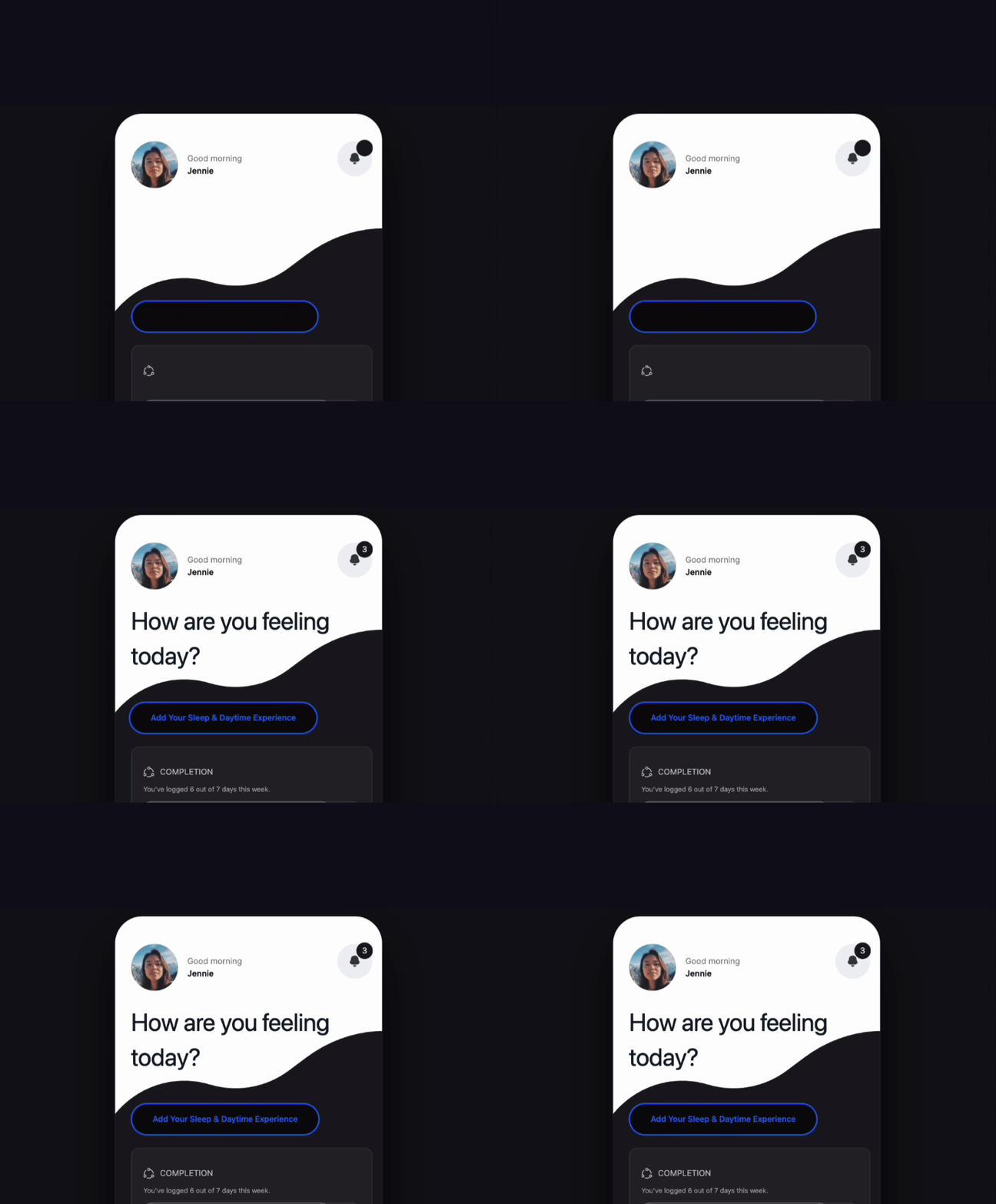
The patient app helps users understand key therapy metrics through clear explanations, contextual feedback and practical guidance.

02 Challenge

The patient journey showed why the missing context mattered. Treatment continues for weeks at home, but professionals usually see the patient only at selected consultations. Between those moments, usage can change because of travel, illness, mask discomfort, fatigue, technical problems or simple forgetfulness. The design therefore needed to capture the reason close to the event without asking patients to complete a full questionnaire every day.

CPAP devices provide rich usage data, but they cannot explain how patients feel or why behaviour changes. This patient-side concept adds a lightweight layer for reporting fatigue, comfort and therapy impact.

Mapping the Care Ecosystem

03 Key User Problems

Three gaps kept recurring in the research. Patient-reported outcomes sat outside the treatment flow; device data showed what happened but not how the patient experienced it; and patients received little useful feedback between consultations. I therefore focused on short PROMs, a clear link to device data and a reporting rhythm that would not become another clinical chore.

From User Problems to Design Goals

04 Before & After Workflow

The new flow adds two reporting moments to the existing treatment journey. Patients complete a short weekly check-in to build continuity; when device data shows a meaningful event such as a usage drop, the app asks one targeted follow-up question about the reason. The answers are stored beside the device history so patients can review patterns and professionals receive context at the next consultation.

Three problems shaped the design: experience was disconnected from device metrics, patients had limited ways to explain changes, and professionals received too little context for the next action.

Before the redesign, patients used CPAP, checked device metrics and waited for the next consultation. The new flow adds two moments: a short PROM check-in in the app, followed by a combined view of device data and reported experience. This gives patients a clearer picture of progress and gives the next consultation context that would otherwise be lost between visits.

Before / after user journey

05 User testing

The two versions exposed a real trade-off. With daily reporting, 90% of participants needed almost no immediate recall effort, but 25% expected high or very high burden over time. Weekly reporting asked more of people’s memory, yet no one rated its long-term burden as extreme. Since preference alone did not settle the question, I used a weekly PLATO-11 check-in for continuity and kept short pop-ups for events such as a usage drop.

The proposed flow adds a weekly check-in to the care journey, with a short contextual pop-up only when a meaningful event—such as a usage drop—needs explanation.

The new flow adds two reporting moments to the existing treatment journey. Patients complete a short weekly check-in to build continuity; when device data shows a meaningful event such as a usage drop, the app asks one targeted follow-up question about the reason. The answers are stored beside the device history so patients can review patterns and professionals receive context at the next consultation.

The first version had three issues: no history, too much to process at once, and little feedback after submission.

06 Design

I turned the questionnaire into two reusable interactions. A seven-week history chart lets patients see how their answers change over time, while a diagonal rating slider makes severity easier to judge than a long list of options. Patients can now see what they previously reported instead of submitting each questionnaire into a void.

Simply digitising a paper questionnaire would still create burden. I used PLATO-11 as a compact foundation, tested daily and weekly reporting, and chose weekly questions plus targeted prompts.

The two versions exposed a real trade-off. With daily reporting, 90% of participants needed almost no immediate recall effort, but 25% expected high or very high burden over time. Weekly reporting asked more of people’s memory, yet no one rated its long-term burden as extreme. Since preference alone did not settle the question, I used a weekly PLATO-11 check-in for continuity and kept short pop-ups for events such as a usage drop.

Interaction Components