CONTACT
INSTITUTIONAL PROJECT
Community service design · Stakeholder experience · Social innovation
A service-design project exploring a more connected and accessible experience for a university-affiliated community.

Project Overview
This project examined the needs, relationships and service touchpoints within a community connected to Huazhong University of Science and Technology. Through stakeholder research and service-system design, the project identified opportunities to improve coordination, participation and access across the community experience.
Role
Service Designer
Company / Client
Changjiang Yuntong · Huazhong University of Science and Technology
Team
University stakeholders and Service Designer
Responsibilities
Contextual research, stakeholder mapping, opportunity definition, service blueprinting, concept development and service prototyping
01 Design
Large type, a clear reading order and restrained colour keep health information easy to scan. Critical data uses contrast above 7:1, and repeated controls behave the same way across the service, which is especially important for older residents and people with less digital confidence.


The same visual language carries across health information, reminders and community services, so the experience feels familiar from screen to screen.
02 Stakeholder Challenges
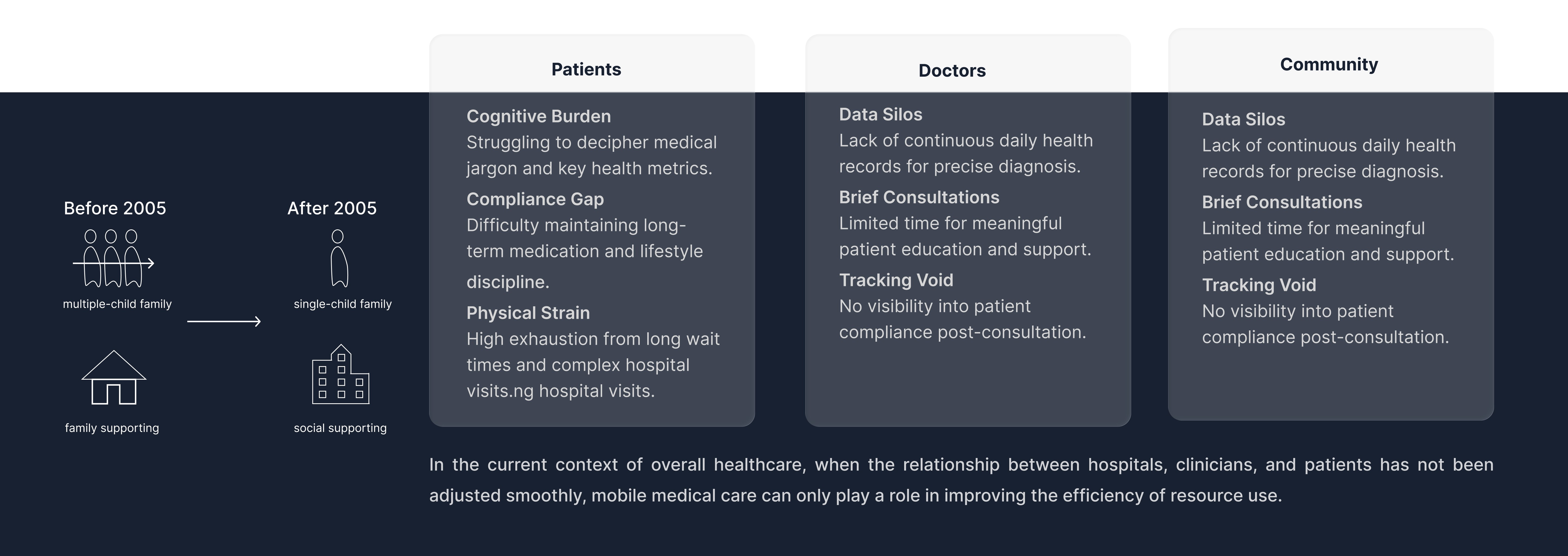
The research showed a different problem for each group. Patients had to interpret medical language, maintain long-term habits and endure repeated hospital visits. Doctors worked with short consultations and incomplete day-to-day records, while community staff had little visibility after a patient returned home. The shared gap was continuity: no one had a complete view of what happened between appointments.
Older residents, caregivers and service providers often face the same care journey from different sides, with limited coordination between them.
03 Current Care Journey
The current journey moved from daily self-management to registration, consultation, tests, treatment and then back home. At each hand-off, information weakened: patients forgot or misunderstood advice, doctors saw only a short snapshot, and community staff lacked timely records for follow-up. The map showed that the main failure was not a single appointment, but the broken connection between hospital care and everyday management.

how older adults move between daily health management, consultation and follow-up, and where support tends to break down.
04 System Gaps
Today, grassroots data is hard to collect, high-risk residents are identified late, hospital resources are difficult to access and institutional care is too costly for many cases. The proposal uses one platform to consolidate records, flag people who need follow-up, support community-level assessment and route complex cases to hospital expertise.

recurring gaps in health information, consultation time and follow-up between different parts of the care system.
05 Service Blueprint

The blueprint follows one resident from discovery to ongoing support. They enter through the website or WeChat, register, build a health profile, complete an examination, review the doctor’s order and later receive reminders or community services. At each step, the backstage work is explicit: the platform verifies enrolment, updates the health record, turns medical orders into follow-up tasks and prepares the information community staff or service providers need. Hospitals remain responsible for diagnosis and clinical direction; the platform and community teams carry that guidance into daily life.
06 Inclusive Design and WCAG
Specifically engineered for the elderly demographic.
By pushing the contrast ratio beyond 7.0:1, we ensure critical health data remains legible even for users with significant visual impairments or under varying lighting conditions.

Large type, restrained colour and a clear hierarchy keep health information easy to scan.

Contrast was checked against WCAG standards, with critical text reaching a 7.84:1 ratio for better legibility.
07 UI Component Library
I used the same navigation, service cards, status messages and support patterns across resident and staff views. Reusing these components reduced relearning and made it possible to add new community services without redesigning the basic interaction each time.

Reusable navigation, cards and status patterns keep the resident and staff experiences consistent across services.